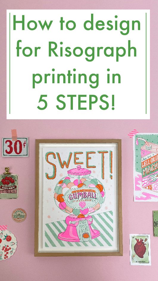
So in this blog post I’m sharing my insights into how I design for Risograph printing. If you’re new to Risograph printing then the main thing to know is that unless you own or have access to a machine then you will be outsourcing the printing to a Riso Printing press. In my experience this is actually a good idea because the machines are the size of a large photocopier and also temperamental to use, plus a printer can help guide you in your design process or colour decisions. Here is a very comprehensive list of risograph printers around the world by People of print
STEP 1 - THUMBNAILS
So as with all my designing I tend to start with small thumbnail sketches and try to figure out if a design is worth pursuing or not, normally I’ll do a bunch of different versions at A7ish to figure how how best to make use of the space on the page (I have a thing against white space 😂) and then I’ll discard all except for my favourite which I’ll keep referring back to.
Unfortunately because I generally discard them I don’t have a great example to share, but here are the initial thumbnails for my A6 Zodiac riso prints that you can see here in my Shop. You can see I’m still undecided on Cancer with the crab on a tin and a paper bag for example:

STEP 2 - PENCIL TO SCALE SKETCH
OK so now I’m happy with the thumbnail I’m going to scale my drawing up to print size so this needs to be decided early on. I always like to work to scale rather than scaling after which can deteriorate lines and generally be a bad practice as you want to know from the start what impact your design will have. So I’ll mark out my page with margins for white space and I’ll work in pencil to start locking in ideas and details. I’ll do a first rough sketch and then work over it to get things fixed. I actually consider all the hard work to be at this stage as once you’ve got this done you’re essentially tracing and refining and it’s all downhill from here! ✨
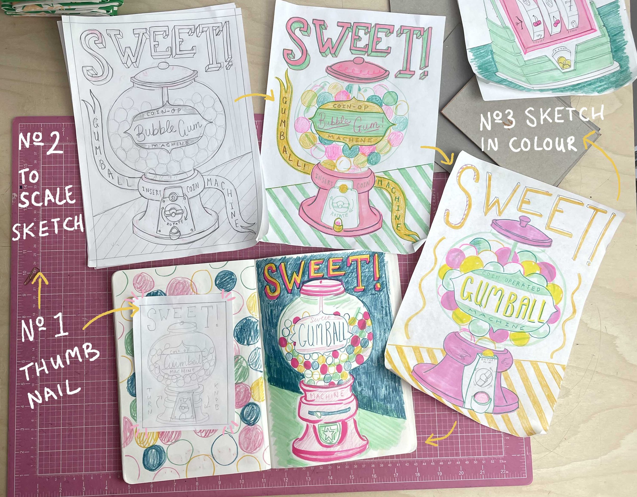
The sketching process
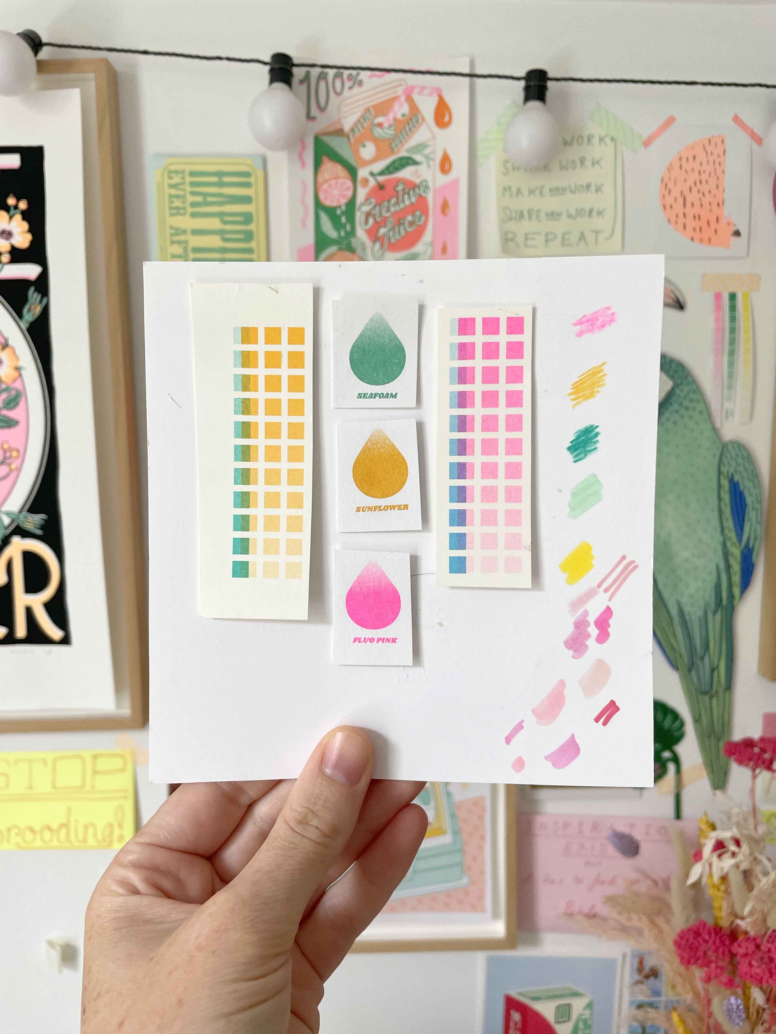
Palette made from printer swatches and felt tip / crayon tests
STEP 3 - COLOUR TO SCALE SKETCH
First it’s a good idea to figure out how many print colours you want to use - this may be based on budget; how much you want your print to cost to the end purchaser, or it may be a style choice.
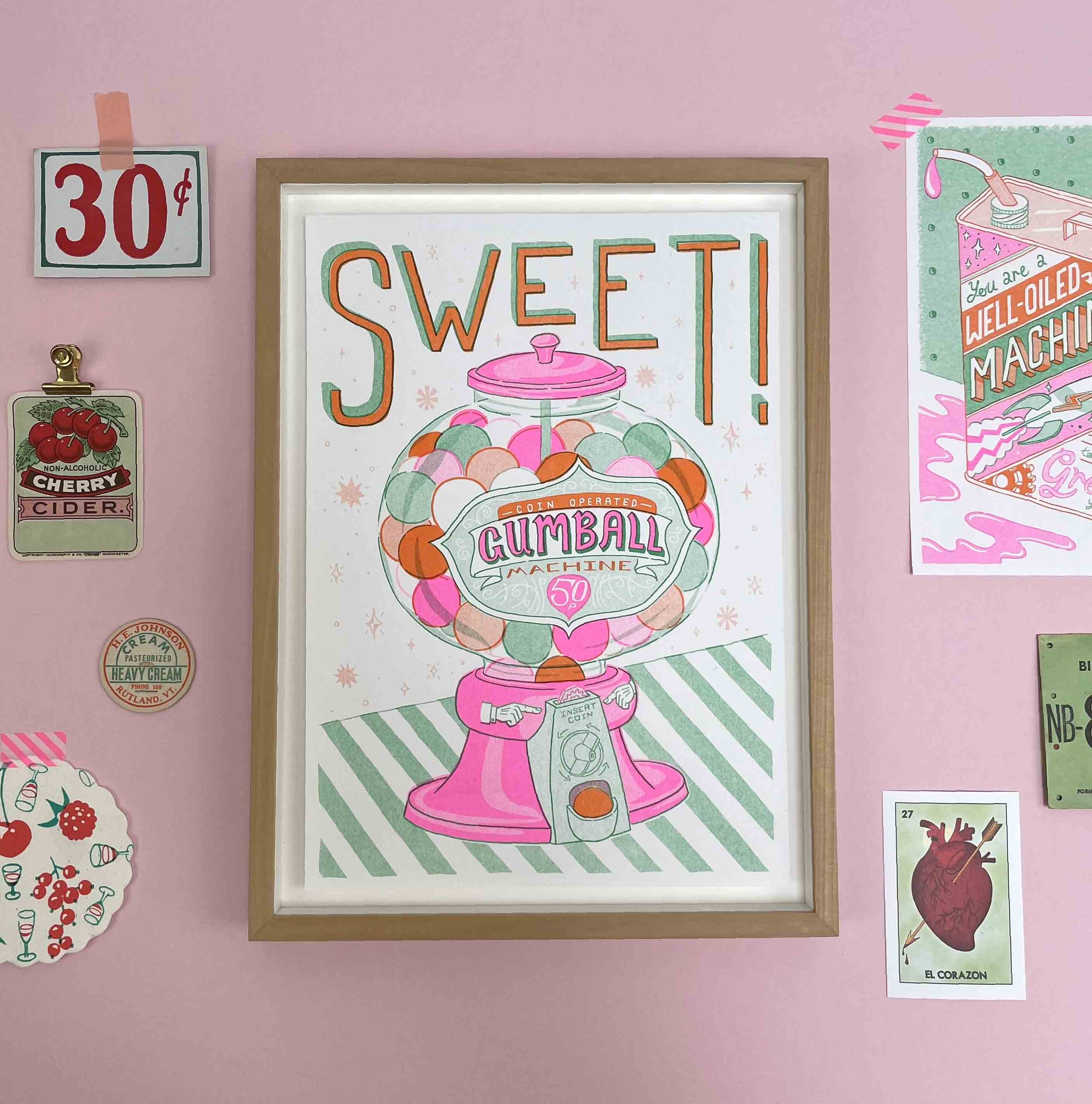
I prefer a fairly small colour palette with potential for overlaying colours to create new tones eg; I often use yellow and pink which can be overlaid to create orange usually at around 60% opacity! So for my Gum Ball Machine I selected Neon pink, Yellow, and Seafoam. I changed this later before going to print but that shows that there is always flexibility and it’s more about thinking and working in a reduced palette, ready for printing later…
Materials: I use felt tips and colouring pencils as that helps me illustrate colours laying on top of one another and the colouring pencils also give a nice texture like Riso 👍
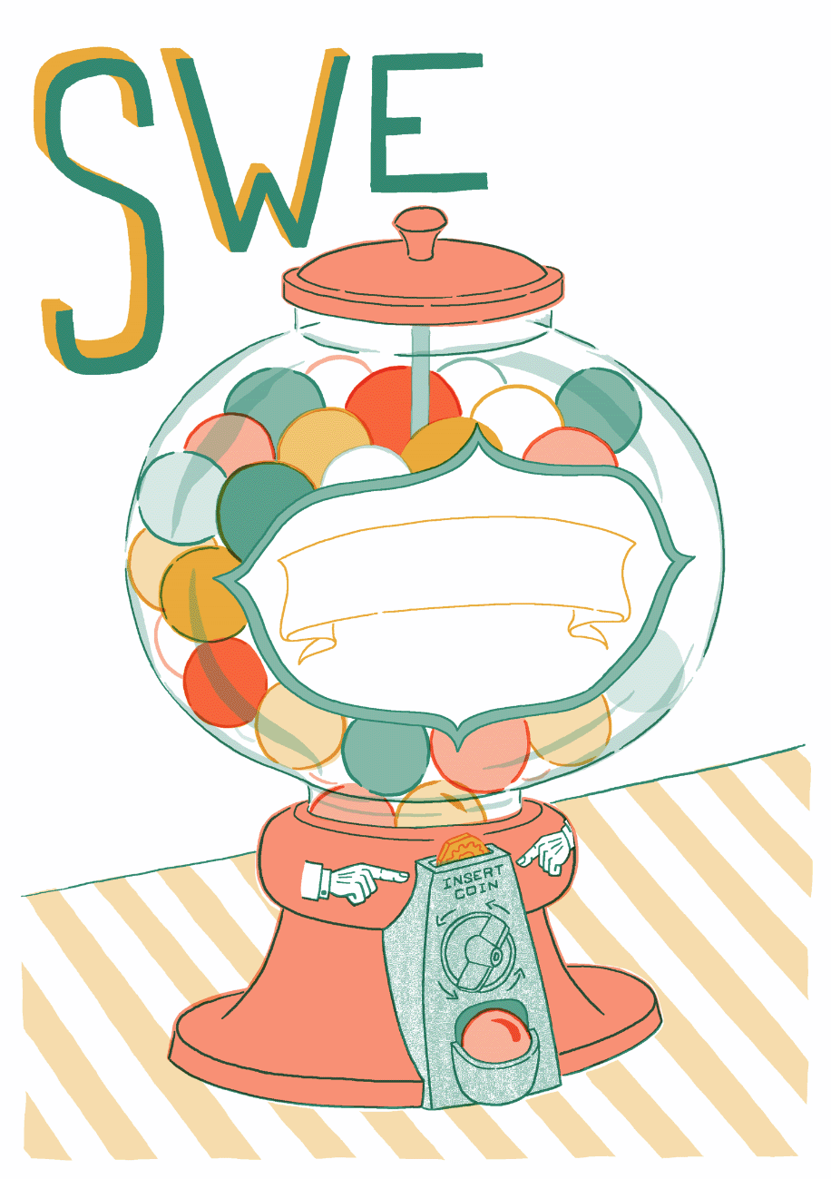
STEP 4 - DIGITAL SKETCH
Now things get a tad more technical and you may diverge into your own preferred software but the principles are the same.
I use Photoshop with nearest neighbour as my pixel preference and anti alias unticked on all my tools and settings. Basically to preserve hard clean edges so that I can drop in other colours and play with colour ways etc I’ll mainly use the pencil tool and I start off by working to scale and in my 3 selected colours with opacities to get those softer tones, that are what’s so brilliant about Riso printing.
Pro tip: to get things looking as close as possible to a risograph use Multiply on all the layers but especially where colour overlaps to see a guesstimate of what will happen!
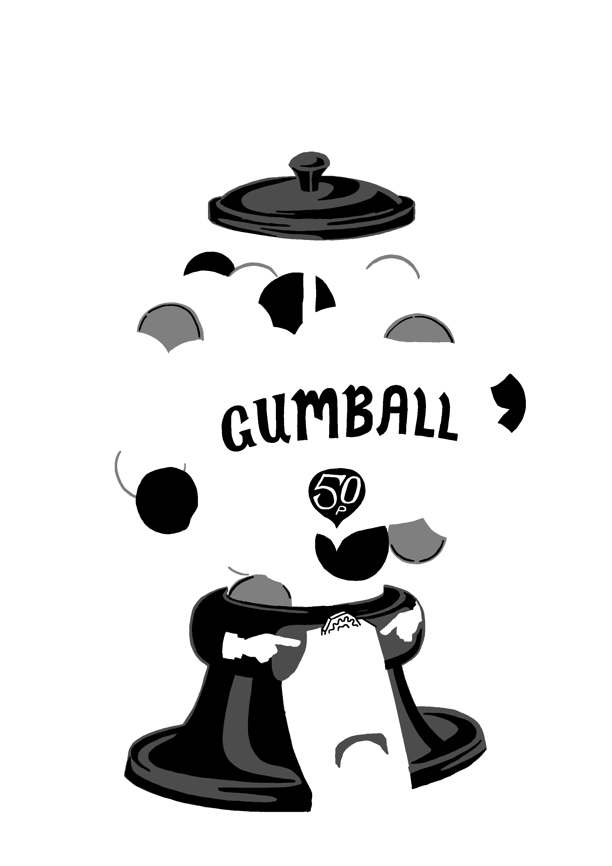
All the layers together and then separated out into their respective hues!
STEP 5 - PRINT FILES:
Once I’m happy I’ll go through each layer double checking that I’m happy with the chosen opacity: do I want it stronger or softer? Before dropping in 100% black so I’ll end up with a grey tone if there is an opacity.
I’ll work on one colour at a time, going through each layer and then flatten all the layers that belong to that colour together.
Then I’ll do the next colour and so on until I end up with 3 layers all in grey tones but named for example: Fluro pink / Orange / Green. Now I’ll save this file as my separations file before creating a pdf for each colour layer: these are my 3 print files.
Pro tip: always double check as you don’t want to print and pay for your mistakes! (been there) Plus send the printer a jpeg of your colour file to show how you expect the print to come out. This way if there are major errors they will hopefully pick up on them before going to print
Now email those files off to your trusty local printer and trust that they’ll come out amazing!!!

DESIGN PROCESS
Check out this video pin for another insight into how I develop my ideas!
Thanks for reading please share with a friend who might find this useful or sign up to my mailing list to know when I drop new Risograph prints!